Brick academy rebrand - Motion language
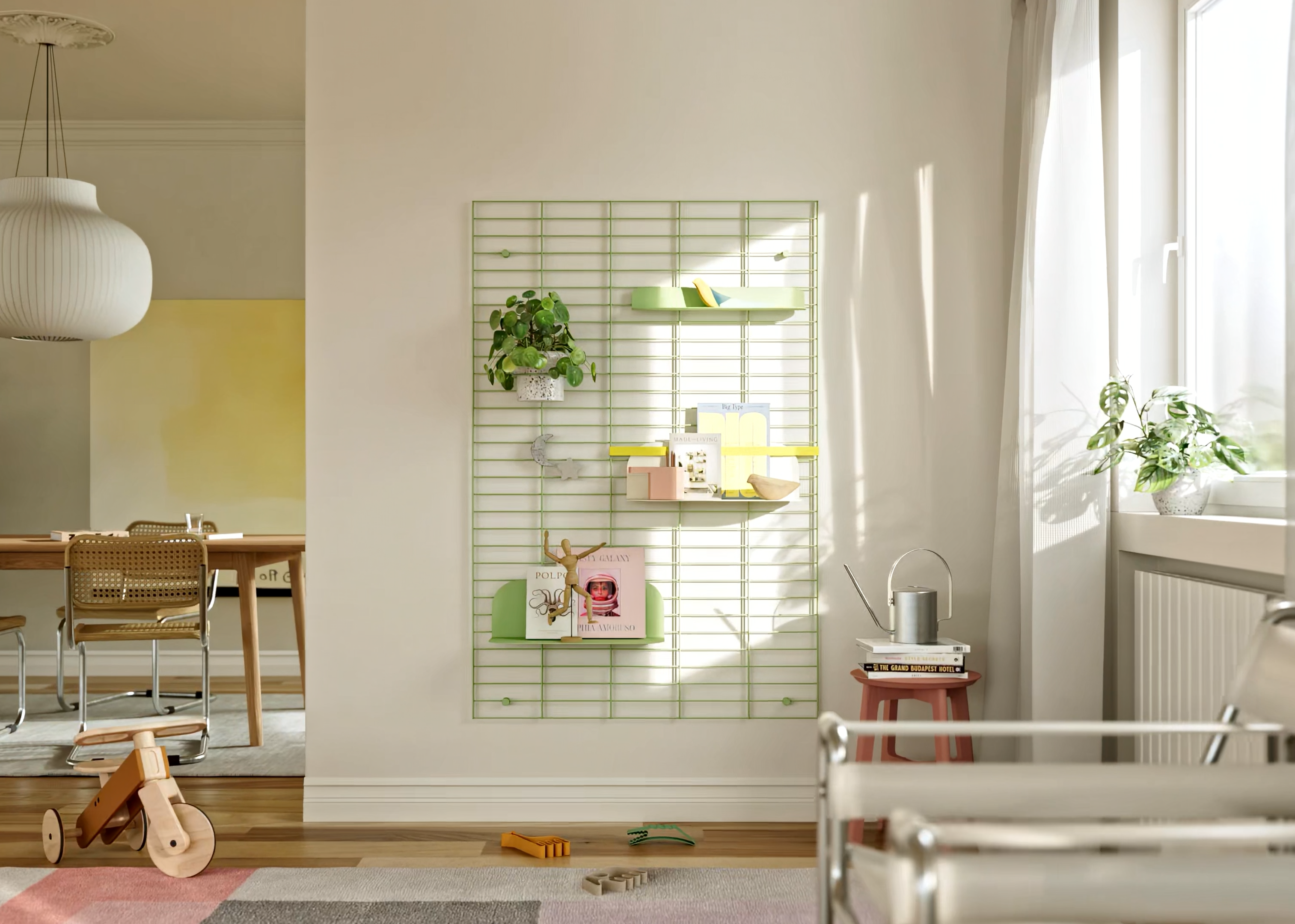
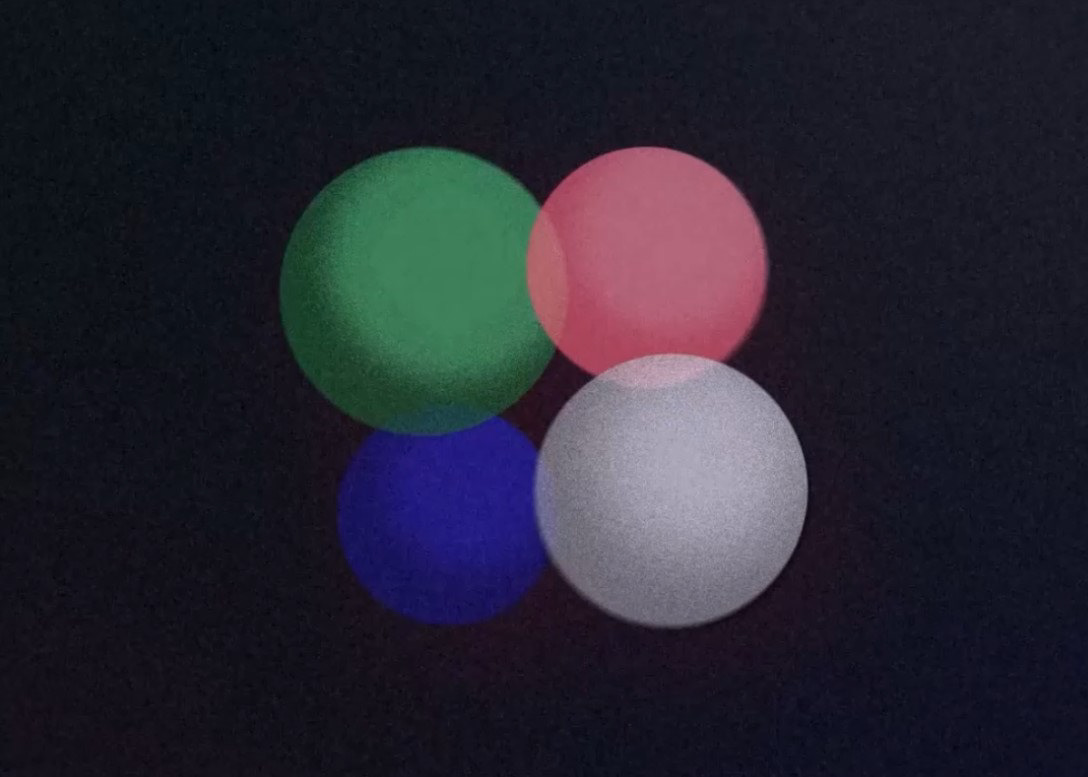
Brick Visual's Brick Academy underwent a brand renewal in 2025, along with its branding video that highlights the concept and creative process behind the transformation. The short film uses the language of color, form, motion, and 3D animation to elegantly express the essence of the renewal.
The educational branch of Brick Visual offers high-level, practice-driven courses are tailored for both aspiring and experienced visualizers.
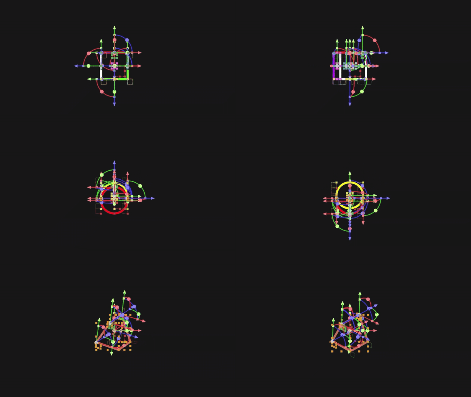
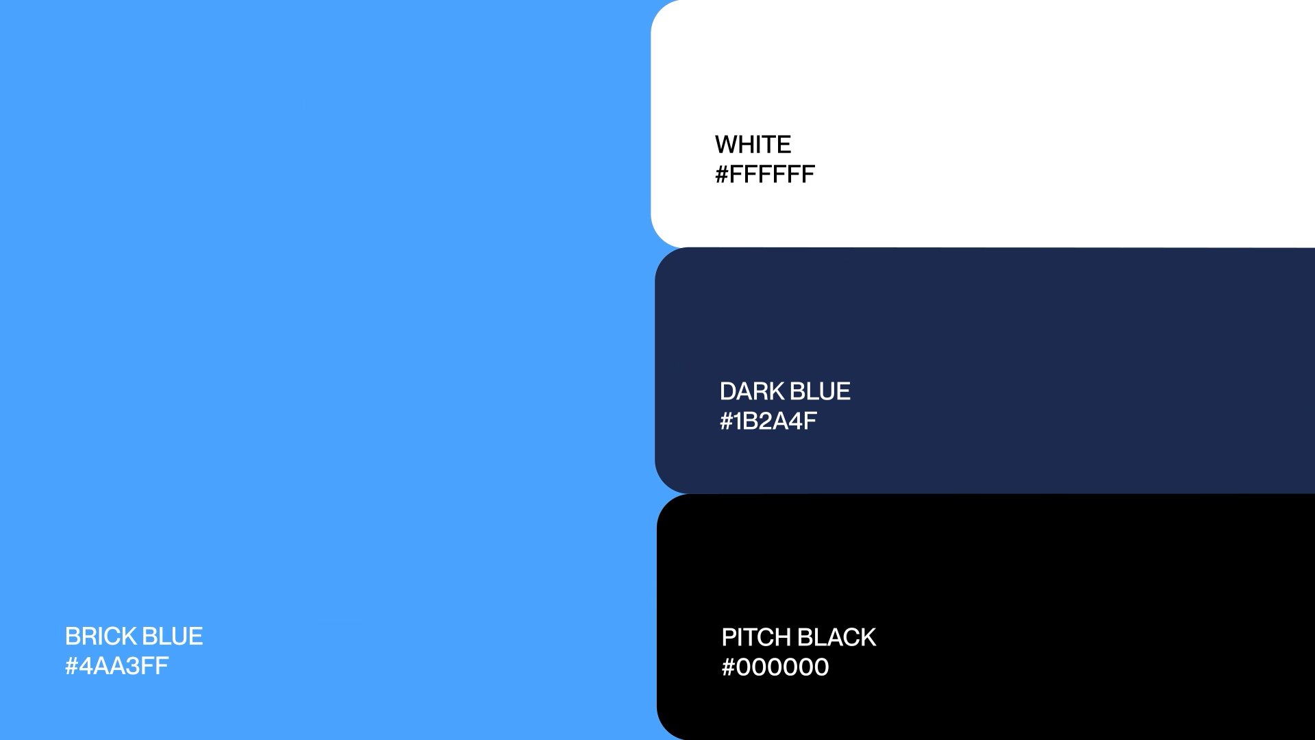
The brand's new identity tranformed from the original triangle logo into a dynamic isometric form, inspired by 3D software UI, introducing depth and movement while also referencing the tools familiar to digital artists. The Brick Neue typeface was retained in the logo to keep the connection brand continuity with Brick Visual. Besides, starting from the distinctive blue colour, the umbrella design has been enriched with a refined palette of deep blues and neutrals to reinforce the visual connection too.
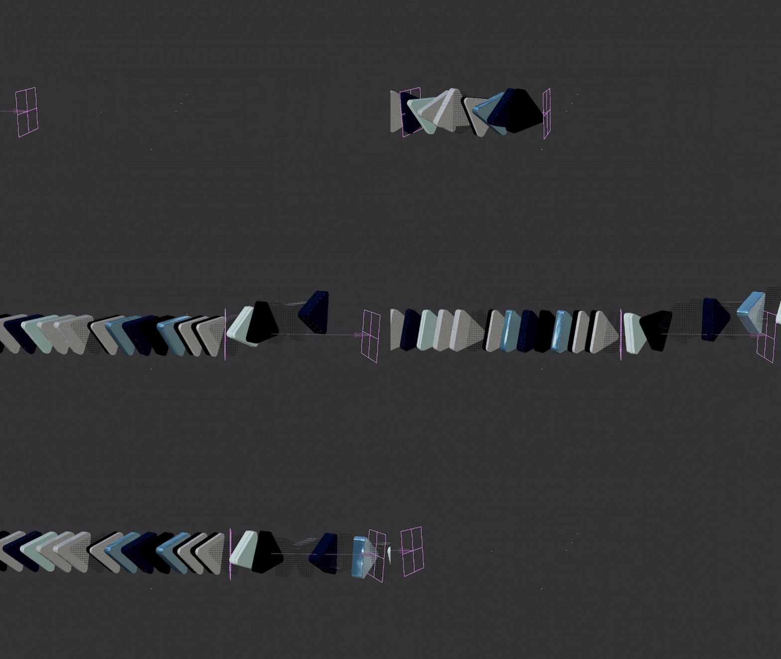
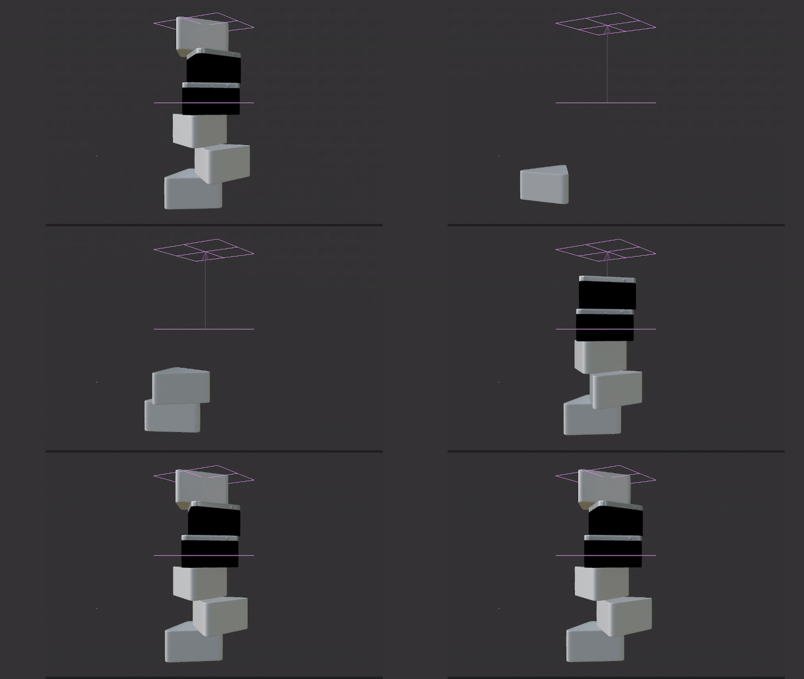
A key element of this video was the seamless fusion of 2D and 3D elements, with the new identity incorporating dynamic 3D components derived from the logo’s evolved form - a triangular prism. This interplay between dimensions was essential in effectively communicating Brick Academy's unique vision, a shift from in-house origins to a mature, forward-thinking brand, built for creatives.
softwares
After Effects / Cinema 4D
ROle
Creative Direction / 2D and 3D Animation / Editing
cLIENT
Brick Academy
credits
Studio: Brick Visual
Motion Design & Direction - Lilla Hajnal
Visual Identity - Studio Stoki
3D Animation - Lilla Hajnal, Zsombor Lukács
Producer - István Lovák
storyboard
new identity
As part of Brick Visual, Brick Academy supports both beginners and advanced designers and illustrators in the field of architectural visualization. When approaching the company’s rebranding, it was important for us to develop a concept that clearly defines and communicates the Academy’s core activities.
logo
We moved away from the old triangle logo and embraced a more three-dimensional direction—reflecting the fact that participants in the training program learn 3D fundamentals, video production techniques, and matte painting skills. The final logotype is a three-dimensional form - a triangular prism - evolving from Brick Visual’s original square/cube logo. Depending on the viewer's perspective - it introduces both 2D and 3D elements into the visual identity, while embodying the Academy’s mindset and educational approach.

Color palette & typography
Our aim was to seamlessly blend these elements into a fluent motion— starting with the evolution of the logotype, and then showcasing the renewed color palette, typography, and a snippet from the website.

motion language
The motion language illustrates the ease with which students at the Academy explore composition, color theory, and visual culture, whether working with still images (2D) or animation (3D).
Discover & create
This spotlight video is crafted to invite everyone to join Brick Academy, showcasing the energy and creativity of our programs. With dynamic cuts and motion flexed through our newly designed system, it’s built to capture attention across all generations.
merchandise
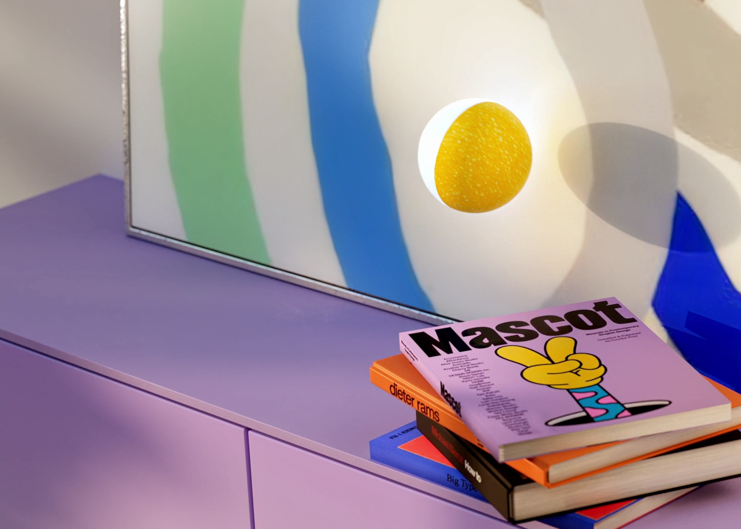
As part of the rebranding, a selection of high-quality merchandise was also created - pieces that aim to capture the spirit and sense of professional class that the Academy stands for.
