Label Design Competition | Bodri Winery
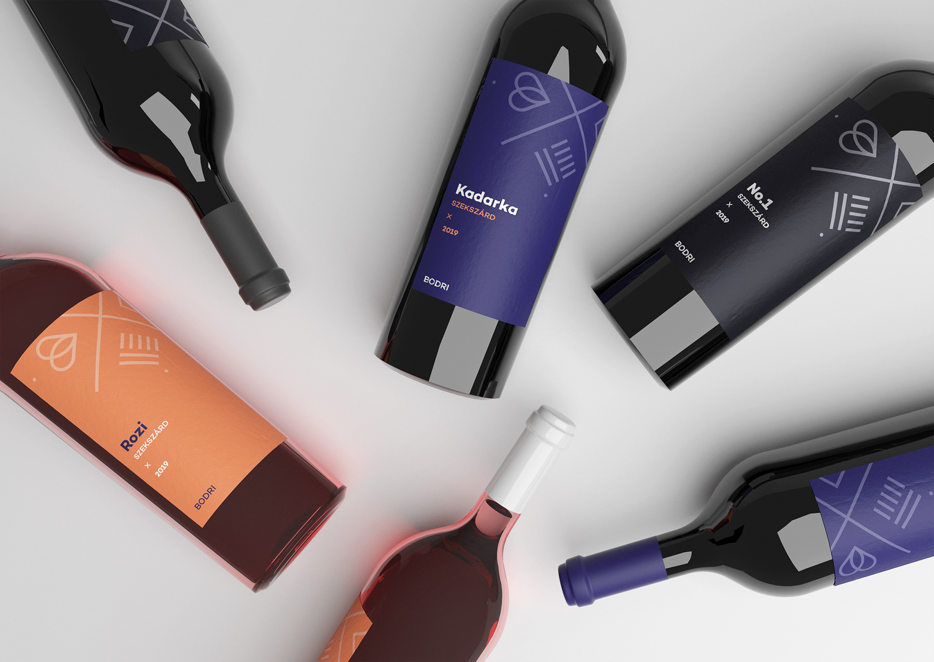
Bodri Winery has been in the market since 2002. The love of grapes and the tradition of winemaking inherited in their family. Over the past few years they realized that the logo and the packaging of their wines does not faithfully reflect their values ( 'The wine which brings us together') and the quality they represent.
Role
Graphics / Motion Design
Brief
Create a logo which reflects on the community experiences of the Bodri wine estate.
Approach
Throughout the entire logo design process, I found it important to highlight
the notion of ‘Bodri and Friends’.
the notion of ‘Bodri and Friends’.
The Symbol
The basis of this concept is the letter X. This is meant to symbolize tables brought together as if engaged by a group of friends. Furthermore, the custom designed icons link the core values of the product family, and represent the motifs of winemaking community, participation and experience.


